Hello, Self Esteem Brands team!
Here are four additional examples of my branding and brand systems work—along with notes about how I approached each. Some were pulled from ‘the archives’, so please pardon the smaller web images of yesteryear! Overall, my approach is to help brands build their business by identifying and defining their broader social purpose, then bringing that mission and personality to every touch point cohesively.
CITIZEN’S STATE BANK–MIDWEST
Citizen’s State Bank–Midwest requested a cohesive collateral system. Awesome! Like many other small businesses, they didn’t know what they wanted beyond that. It was ambiguity at it’s best! So I dove in.
What were their customers saying about working with them? What was their mission? What made their hearts sing? What was it that made them stand out from their competitors? I discovered they had tremendous pride for their city and it’s people—they were all about authentically showing up and serving their community.
To echo those sentiments, and to give the bank a look that would stand apart from its competitors, I brought in elements inspired by the city’s surroundings. Lakes, streams, and natural vegetation served as inspiration for calm, earthy colors and textures. Imagery of happy families coupled with a polaroid-esque treatment conveyed the happy, confident feeling you can have and the moments you can share when you know your finances are on good footing.
The new brand feel was loved by leadership and all their employees, and soon the textures, tones, colors and sentiment were fluidly implemented across many touch points: brochures, website, collateral, ads, posters, direct mail, etc.

The full color palette of calm, earthy colors were used to organize subject-specific brochures.

Linen-like and wood grain textures added an earthy, rich and cozy feeling to the brand.

Texture, color, typography, photography and tone all came together to create a beautifully cohesive look and feel.

The new branding worked great for event advertising as well, like these an on-premise posters.

On-premise poster.
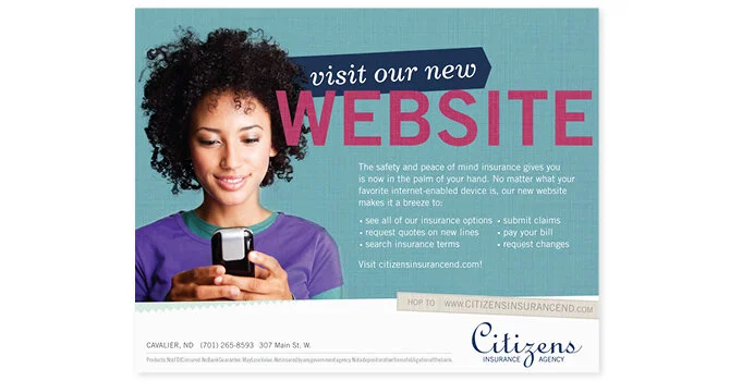
Insurance insert / ad.

Insurance agent direct mail piece.
NORTHERN LAKES MARKETING REBRANDS TO SPARK5
The local agency had outgrown it’s northern lakes roots, so our team of four set out to rebrand the company and give it more modern flare. We had Passion. Smarts. Creativity. Lots of Spark! And we focused our offerings to 5 key services: strategy, research, branding, creative and web design. I paired skinny matchstick-like typography with a pixelly firework to convey the renewed positive energy and enthusiasm of Spark5. To contrast the more geometric wordmark, I also introduced a very approachable, friendly buddy to the brand. Our mascot, Flint.
The new look, feel and tone was expressed across letterhead, envelopes, business cards, stationary, memo pads, website, ads, and all our major channels.

Logo, business card, stationary and envelope.

Flint, memo pad, address label, collateral. I was also the copywriter for both informational inserts shown.
VALLEY GREEN BANK
This Philadelphia bank came to us with just a logo and miss-matched assets. So I took the initiative to help them hone in on their true brand personality. Even as a very young bank, they were well-known and well-liked amongst small businesses in their suburb. They were a very vibrant, driven, and creative team, excelling at making personal connections and finding ways to help businesses with creative loans. We partnered with a local photographer to make sure we brought real people to the forefront of their brand. By pairing images of local customers with vibrant colors like celery green and turquoise, I was able to illustrate the bank’s high energy and commitment to the community they served.

Brochures for VGB: A tree symbolizes community and growth for the Personal Banking brochure, while a bridge is used to symbolize partnership for Business Banking.

On-site testimonial poster series using custom photography, branded blue line and celery green lined pattern.

“We Switched” campaign pieces that used VGB’s vibrant colors, custom photography and fresh type treatments to expand and grow the look: poster, print ads & digital ads.
RELIABANK
Reliabank needed a cohesive brand presence, starting with a new logo and echoing into all their collateral and marketing channels. They started with roots in ag lending and grew into all avenues of banking, so I created their logo to feel akin to a field of green with a sunrise coming over the horizon, providing an uplifting feeling and a visual that would quickly resonate with ag farmers and the surrounding community. From there, fresh kelly green became their key color, with light blues and a bright pop of sunrise orange complimenting it. Clean lines and great typography brought the look together, along with a tone that was approachable and straight-forward.

Brochure Series & Stand-out Service Brochure.

Logo and Business Collateral System.
(Sadly I only have this low-res file!)

Direct mail announcing a grand opening party for the local community.